I Shot The Sheriff: Deputy’s Stellar Brand Refresh
June 3, 2021
It started with a problem in need of a solution
Few Australian tech start-ups have had the success that staff scheduling app, Deputy, has enjoyed. Like many successful companies, its origin story revolves around a problem without a good solution, so the founders created one.
In Deputy’s case, Steve Shelley experienced a lot of headaches scheduling staff for his aviation company. Enter Ashik Ahmed, now Deputy’s CEO, an engineer who built the first Deputy app. It worked so well in helping to scale and drive efficiency that they decided to offer it to other businesses with similar staffing issues.
Launched in 2008, Deputy now has 300 employees serving over 250,000 workplaces and over 1 million shift workers.
Deputy positions itself as second in charge—deputy to the business owner—with a mobile app that schedules shift working across teams, tracks attendance, navigates complex pay rates, lets employees swap shifts and request time off. Originally focused on solving the employer problem of scheduling, the app is so user friendly that workers also now view Deputy as their second in charge.
Not ready for Times Square
A rebrand, or ‘refresh’, as Director of Design Lisi Schappi prefers to call it, was in the works for years. But a problem with many companies is pulling the trigger, not just to make the financial commitment, but also the commitment to staff time and the willingness to risk change.
The pandemic hit Deputy hard, as most of their clients are in hospitality, retail and healthcare – sectors which were either decimated or had to reposition themselves to fight on the front lines. However, good companies see opportunities even in a crisis, and Lisi decided this was the right time to push for a refresh.
‘It actually gave us the space to really think about the impact we wanted to have on this new world of shift working and how we could go about creating a brand that would resonate with shift workers and business owners. So, we started thinking about our mission, our vision and our values as a company, and in parallel to that we started doing this brand project.’
Lisi had the clever idea to mock up their logo—which included a sheriff’s badge—on a banner in an image of Times Square. Sometimes enlarging something, even as an imaginative exercise, can reveal faults you hadn’t considered. In Deputy’s case the sheriff’s badge did not reflect who they were and had potentially negative connotations in the U.S., with their controversies involving the police.
‘We want our brand to resonate with every community,’ says Lisi.
As well as responding to the social and political environment in the U.S., another reason for the refresh was to stand out from the competitive landscape. ‘There are a number of other management solutions out there,’ Lisi points out. ‘Everyone is blue, and we were another blue. We really needed to consider how we would stand out from the crowd.’
‘It actually gave us the space to really think about the impact we wanted to have on this new world of shift working and how we could go about creating a brand that would resonate with shift workers and business owners. So, we started thinking about our mission, our vision and our values as a company, and in parallel to that we started doing this brand project.’
Before
After
‘We had diverse people in these groups with different perspectives, but ultimately we were all super inspired by the idea of this being about the people who use our product and the people we serve.’
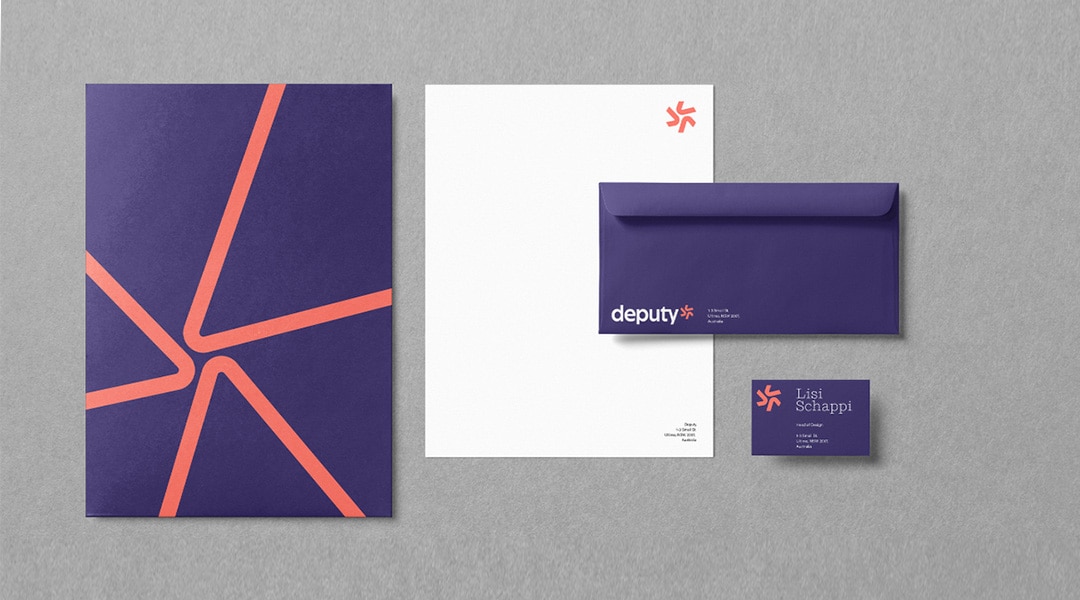
People first
Deputy worked with a U.S. agency to create a new design that would re-energise the company from the inside out. They wanted to reflect their brand attributes of being welcoming, intuitive and trusted and embed that across their product for a more consistent brand experience across all touchpoints.
They engaged fifty people across Deputy, from customer support, marketing, product development, strategists, and executives to collaborate on the refresh. They had weekly catchups with this mix of people they called brand champions, looking at different logo ideas, colour pallets, campaigns, illustration styles, and typography.
‘It was amazing because everyone was so enthusiastic and honest with their feedback,’ Lisi says. ‘We had diverse people in these groups with different perspectives, but ultimately we were all super-inspired by the idea of this being about the people who use our product and the people we serve.’
One priority was accessibility, which meant being mindful of the colour combinations so that they were easy to digest for those who were visually impaired.
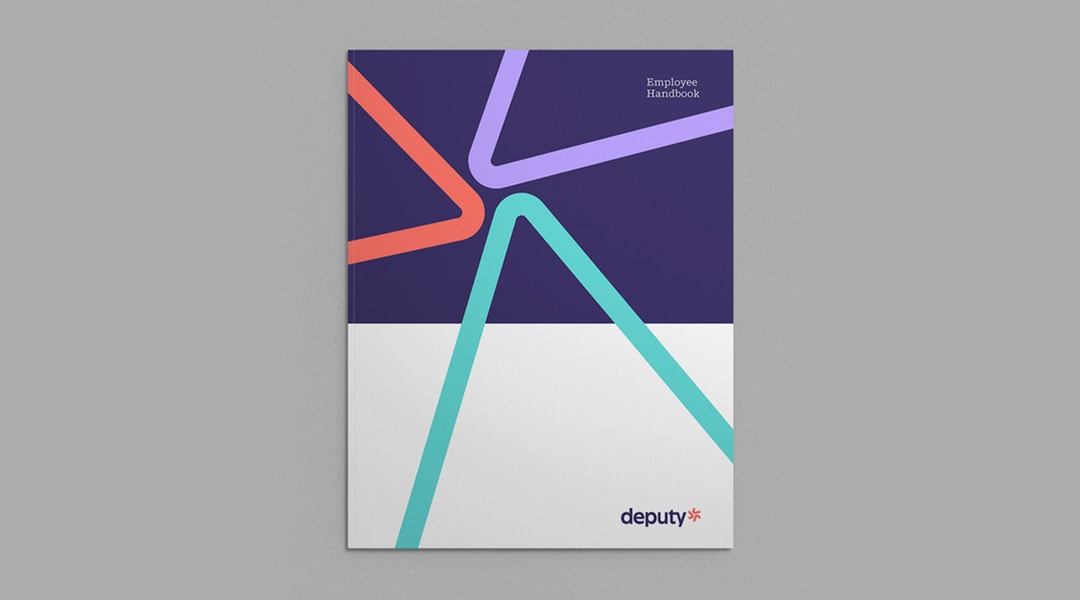
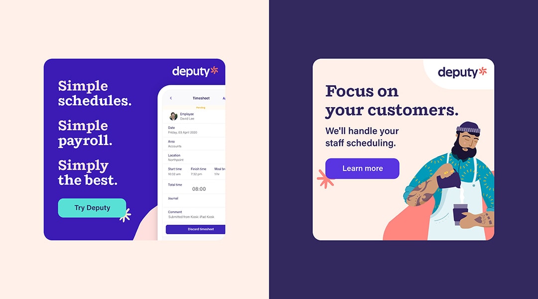
Another priority was inclusive design, which meant an illustration style that was playful, yet sophisticated and unique. Their previous branding didn’t include any faces. Now it does.
Another goal was conveying the idea of Deputy being the second in charge. ‘Originally,’ says Lisi, ‘Deputy was meant to be deputy to the owner, but now I feel we’re the second in charge to everyone who makes up a thriving workplace.’
Deputy spoke to several customers to get their insights into what information they would need to make the refresh seamless for them.
Deputy took six months to create their new brand identity, then eight weeks to roll it out. It was a huge effort from everyone in the company, but it has proved to be very successful.

‘It’s very clear that we stand out from our competitors now. We’ve had great success in our sign-up rates, and our conversion continues to be high. That’s definitely a sign that people are connecting to this fresh look and feel.’
The metrics
Deputy’s engagement score has jumped twenty points over the last six months.
‘It’s very clear that we stand out from our competitors now. We’ve had great success in our sign-up rates, and our conversion continues to be high. That’s definitely a sign that people are connecting to this fresh look and feel.’
Lessons for your company
Lisi says there are two lessons she learned from this experience. ‘One was the importance of executive buy-in and stakeholder management and having the ability to sell the project to different types of executives. In my first approach to selling it, I was definitely looking at it through a design lens. But I had to speak their language, and that was a huge learning for me.
‘The second point is that the process is super collaborative and that’s why I think the brand was successful. We got warnings from the brand agency to have a small project team. And I thought, I don’t think that’s going to work for us. And the large team was hugely successful. I think if we hadn’t been so collaborative perhaps, we would have created a new brand that completely missed the mark. It would have been more a design project than a brand project.’
This blog post was inspired by our recent episode on Rebranding Branding: The Podcast, featuring special guest and Director of Design at Deputy, Lisi Schappi. If you would like to hear the interview, listen or subscribe here.

Darren Taylor
MD & Head of Strategy and Research
Find out how your brand stacks up.
Take our 5 minute self-assessment to rate the strength of your brand.
Have you downloaded our book, Rebranding Branding?
Download it here.
Got a brand problem or opportunity and want to chat?
Book a no-obligation 30 minute chat here with Darren Taylor.