Helping Freshwater Creek Steiner School find their unique identity while honouring their signature educational model
Freshwater Creek Steiner School
Freshwater Creek Steiner School is located in the Surf Coast Shire, about 20 minutes from Geelong. The School was looking to increase awareness among parents seeking to put their child through an alternative education stream, offering healthy and holistic learning and development.
Brand Research
Brand Strategy
Brand Identity
Brand Creative
Brand Guidelines
The work
Our approach needed to be two-pronged. Firstly, we needed to consider the overarching ethos of the Steiner School educational model. Secondly, we needed to demonstrate Freshwater Creek’s unique offering so as to drive local school admissions in a rapid growth corridor.
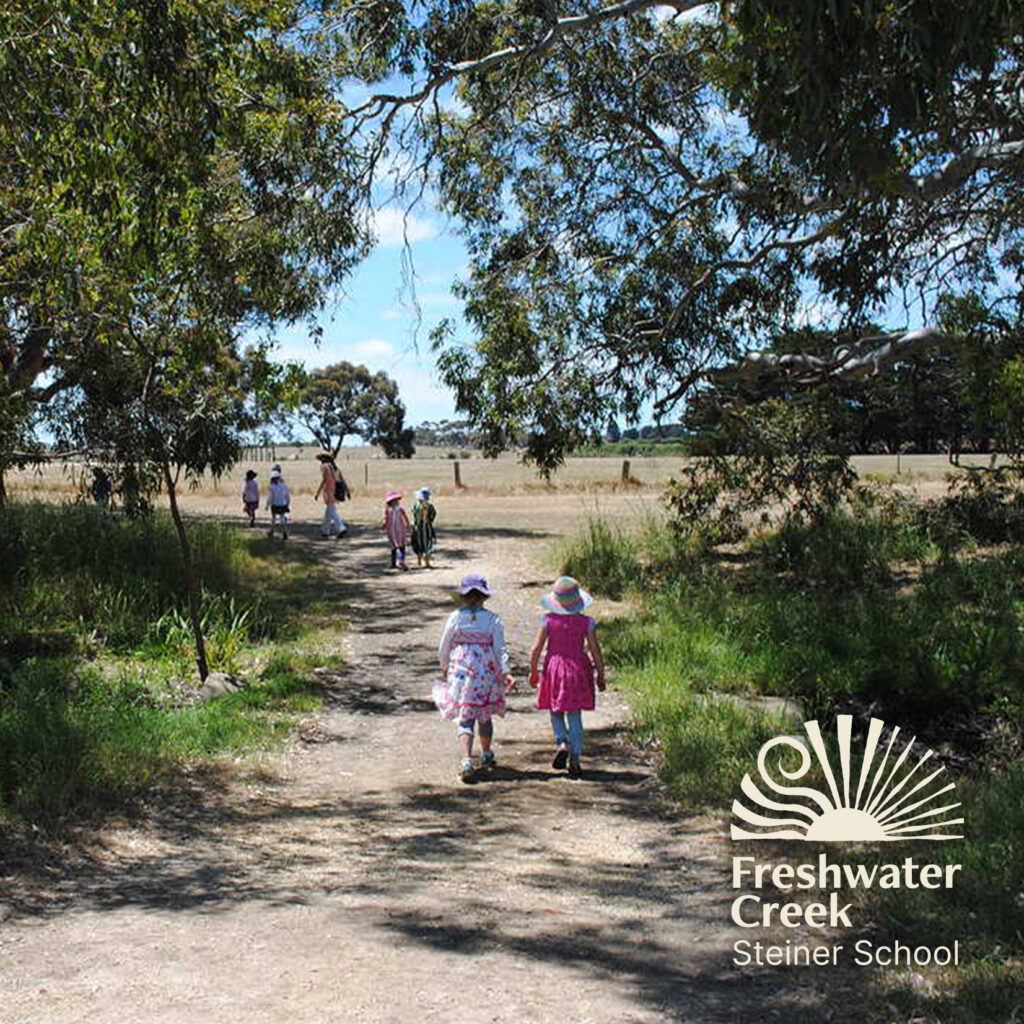
For the first prong, the inspiration came directly from the source, Rudolf Steiner, who founded the global Steiner movement in 1919. One of his beliefs was that humanity needs to work organically in cooperation with nature, not against it. He sounded warning bells about many issues, such as sustainability and the depletion of human and natural resources, which are of wide concern today. This core idea informed the strategy and later the creative, which is grounded in nature and the elements.
From a Freshwater Creek perspective, it was integral that we got on-site to immerse ourselves in the school and meet and speak to the staff and students. There we saw teaching in action and experienced the facilities and grounds first-hand. We then ran a workshop with staff on-site to determine the brand’s objectives and strategic intent.
The brand look and feel was to reflect the values of the school through symbolism and needed to be organic in its presentation and rollout. It was our intention that it looked like it was created by members of the school community. ‘For the school by the school.’
““The work T&G did was brilliant. They helped us to tell a complex story simply and credibly to some of the world’s most influential leaders in the government policy, agriculture, and corporate sectors.”
The result
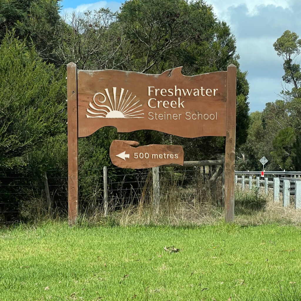
The result was a brand that was steeped in symbolic meaning that resonates with both the children and the wider community at Freshwater Creek. The logo when broken down has five individual elements; currents, to represent the creek after which the school is named, a curling beam to symbolise the nurturing spirit of the school, sunbeams to demonstrate the sacred force of life and radiating light to show the journey of personal growth. Each of the individual elements stem from a solid foundation at the base of the brand device, representing the solid foundation the school provides.
The clarity gained from brand strategy has helped unite the school – teachers, parents and students alike by providing them with a unifying narrative that they feel accurately portrays them and they are proud to stand behind.