Practice what you preach: rebranding Taylor & Grace
Tayor & Grace
Taylor & Grace turned 14 last year, and we decided it was well and truely time for a proper rebrand. We were always busy working with others’ brands, and decided it was time for us to practice what we preach! Our brand identity was dated, and didn’t reflect our current value proposition and evolved client focus. So we used the time during the COVID-19 hibernation to turn our process on ourselves and do our own rebrand. We updated our brand strategy so that it was a better reflection of who we now are, before studio then had the monumental task of redoing our visual ID.
Brand strategy
Brand creative
Style guidelines
Brand collateral
Website design
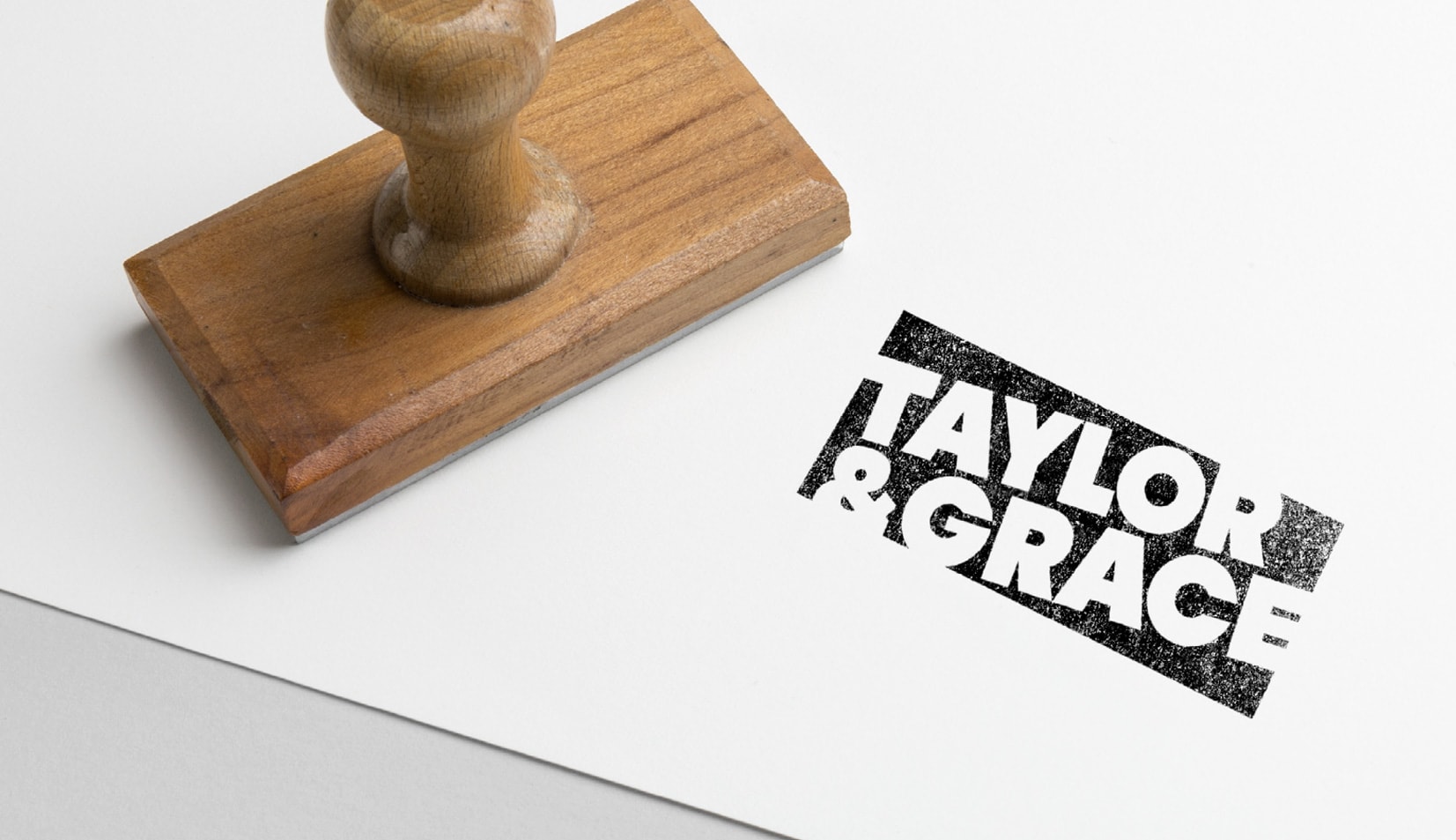
Stamping our mark.
We wanted to be different. So we took a conventional logo and inverted it. The angled box draws your eye to it, and the words are breaking out of the box suggest ‘out of the box thinking’. Our logo is a bit quirky (like us). It’s not quite straight (like us). It’s a play on the original meaning of the word ‘brand’ – to stamp your mark on something. Our logo visually suggests a stamp and is applied like one – the supporting quirky imagery is allowed to shine through the logo, creating a different effect each time it’s applied.